
What do you think of the new website?
(If you’re reading this post through email, click here to see the new site.)
Going into the process, I knew I wanted something bright and cheery – but also whimsical yet modern, and youthful yet grown-up. (Contradictions galore.) It’s taken many months of hard work to get here, and I am so excited with how the design finally turned out! Perhaps one of my favorite parts of the new design is how organized it is:

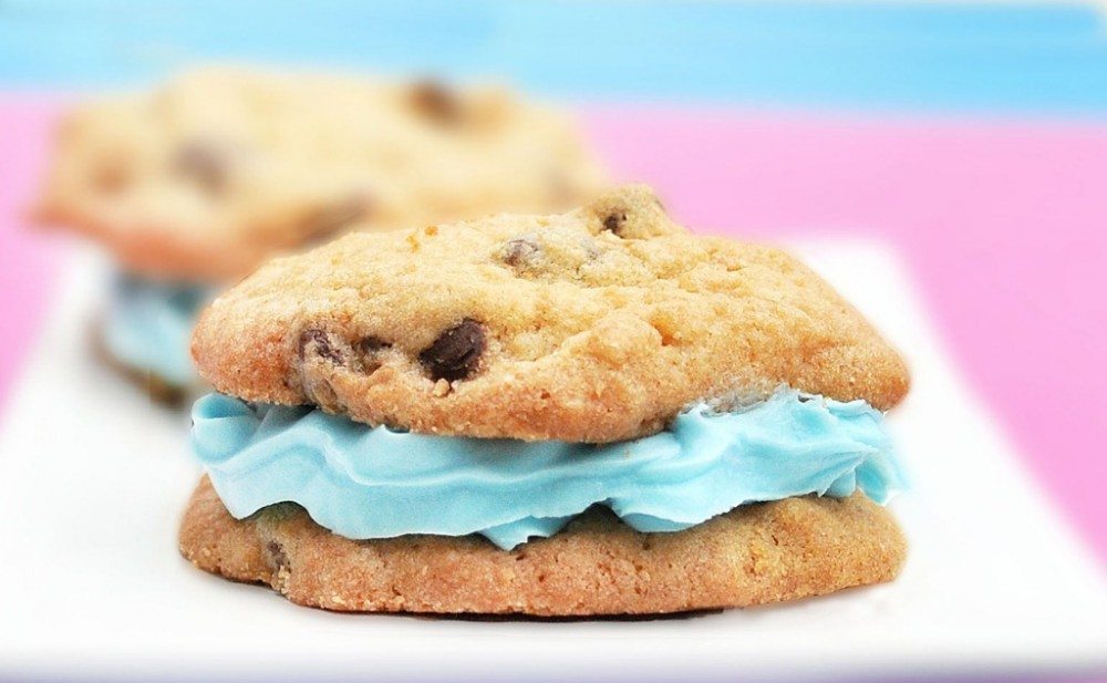
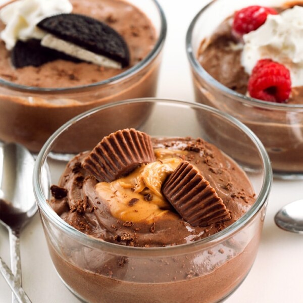
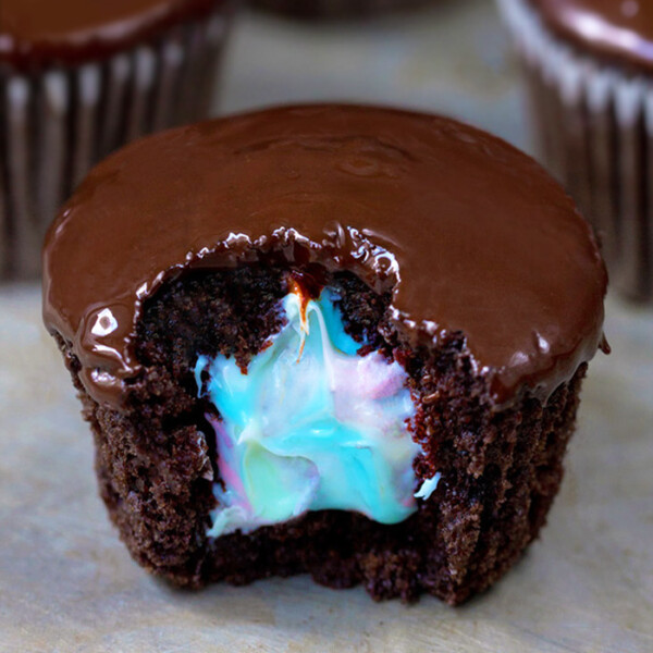
For example, the new recipe page is incredible!
A picture of every recipe! Plus there’s a fancy slideshow on the homepage, and the sidebars are much less jumbled now. If you think I managed these feats by myself… you are giving me way too much credit. Allow me to introduce…

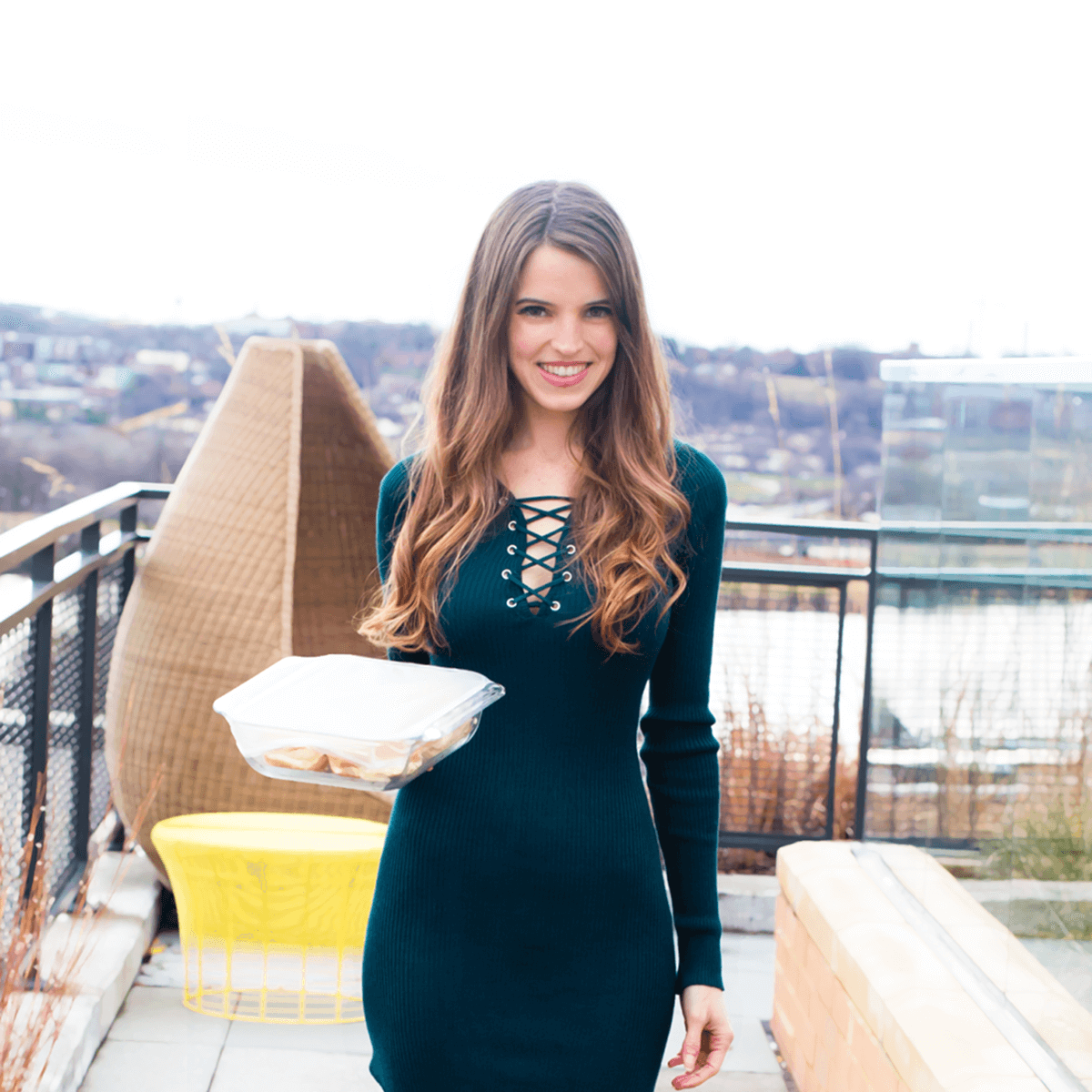
Julie Farber from Deluxe Designs.
Julie is amazing; I wish I knew half of what she knows about web design. Julie can design your entire site for you if you don’t want to worry about a thing. In my case, however, I preferred to be very involved, and she was ok with that, too! I drew up elaborate screen shots in Photoshop of exactly what I wanted—right down to the color scheme and layout—and Julie took it all from screen shot to real-time website without crashing anything, which I would certainly have done if I’d attempted it without help. She was patient and non-judgmental, while still offering sage web designer advice. (You can thank her for the fact that there are no giant polka dots on the top of the page: one of my not-so-bright ideas she talked me out of!)
And those beautifully-organized new photo pages I mentioned earlier? All Julie’s work. I can’t tell you how many things I asked for, while being almost positive she’d come back and tell me such things weren’t possible. Yet every time, she instead responded—quite quickly—she’d made the changes. In short, if you need design work for your food blog (or photography blog, company website, etc.), Julie is your girl! EDIT: Julie will give a 15%-off discount to anyone who mentions CCK in his/her inquiry.
Still to come:
1. The heart logo: The header that you see now is an interim thing, so don’t worry if you’re not big on the heart; it’s not staying! I am not big on it either. I’m a perfectionist and haven’t been able to come up with the perfect logo yet, so I quickly designed this shutterstock-esque heart logo to stand in. The rest of the new design was ready, and I just didn’t want to wait any longer!
2. We’ll probably be making more minor adjustments in the next few days, so give the site a little time to adjust. And Julie is working on perfecting the mobile version of the website as well.


LOVE!!! Love everything about this new design. Great work! I even like the heart- it’s a cute idea!
It’s great! Love the new look! It is so much more clean looking, organized, and cheerful. And one thing I had wanted for a while was the pictures to go with each recipe IN the index. SO AWESOME! Thanks for the user-friendly update! Congrats!
About the new website….one word…professional! I know you said you were changing the heart logo eventually, but I for one like it….a lot. Great job, Katie.
I love this! I think the logo would look really cute as a mixing bowl with a wooden looking spoon sticking out of it. 🙂
I love your new blog design, I find it much more prettier and modern than the older. Your index page is also very convennient and it’s much more easier to find your recipices.
I LOVE the heart!!! It’s quite appropriate for those who truly LOVE food (like me). The changes are beautiful. As stated by other readers, it is easy to read & the sidebars do look better. Thank you for putting so much work into your site. It is one of my favorites & I send ALL of my clients to your page for healthy treats. 😉
Hi Katie, loving the new look and feel. The website is much more difficult to view on small devices such as iPhones, as it doesn’t auto resize like the old one. It’s trickier to navigate and read now on a phone xxx
Love the new look of the blog!
Just a note: On chrome, if the window isn’t wide enough the sidebar goes to the bottom of the page and the posts go wonky and the margins expand so that you have to scroll sideways to read the them.
The site is looking good! I actually like the heart logo, I think it looks really cute and goes with the “chocolate covered” part.
Positively lovely! The new logo is adorable!
I love the new site. I think its bright and clear!!! I am not a vegan, but love the recipes for healthier options. I do have friends though that are more vegan than me ( does that make sense?) so I have been turning them on to your site. Thanks for all your hard work.
I’m totally new to blogging. Yours is the only one I have ever consistently read. I mean, come on, you are sharing some seriously important info here!! I really love how clean and still dripping with chocolate the new site is. It’s so easy to navigate. I just started a blog a few weeks ago and look to yours for guidance on organization, etc. I blog our eating habits for my friends and family, so I just used a weebly template. It’s for techno-dummies like me. If I ever decide to invest myself in my blog the way you have, I’m sure I’ll look up your designer. Well done!!
love it!
Hi again!! Before I sound like I am complaining let me explain that I access this site 5 times a day, every day. Seriously, I don’t eat anything that is not made of this site. The more I keep accessing the new site the more complicated it seems…haha! Is it at all possible to include a link on here to view the site in old format??
This looks awesome Katie! I have always thought your blog was stellar just for it’s content alone, but now you have a blog design that matches the content. It’s just as yummy as one of your sweet creations.