
What do you think of the new website?
(If you’re reading this post through email, click here to see the new site.)
Going into the process, I knew I wanted something bright and cheery – but also whimsical yet modern, and youthful yet grown-up. (Contradictions galore.) It’s taken many months of hard work to get here, and I am so excited with how the design finally turned out! Perhaps one of my favorite parts of the new design is how organized it is:

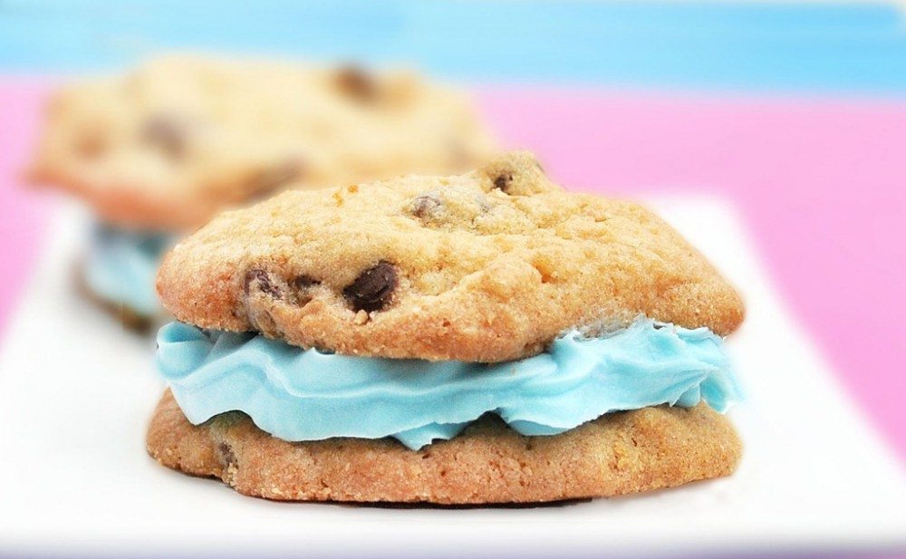
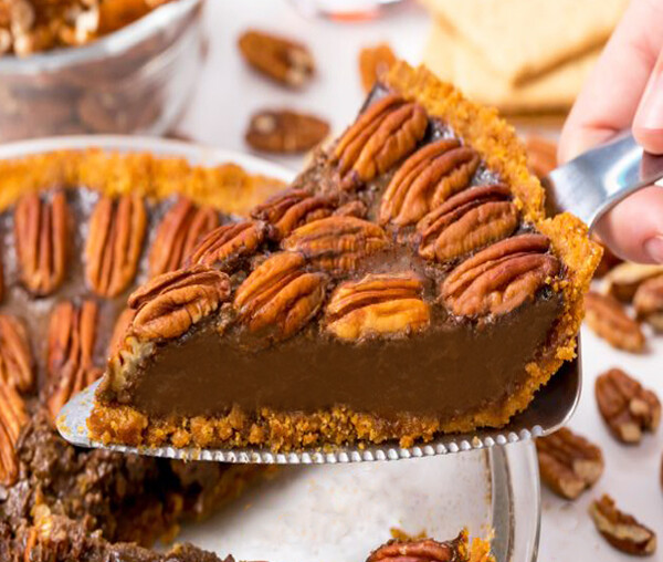
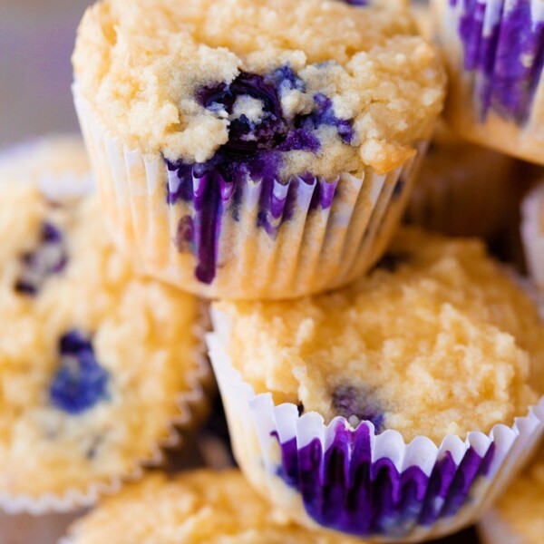
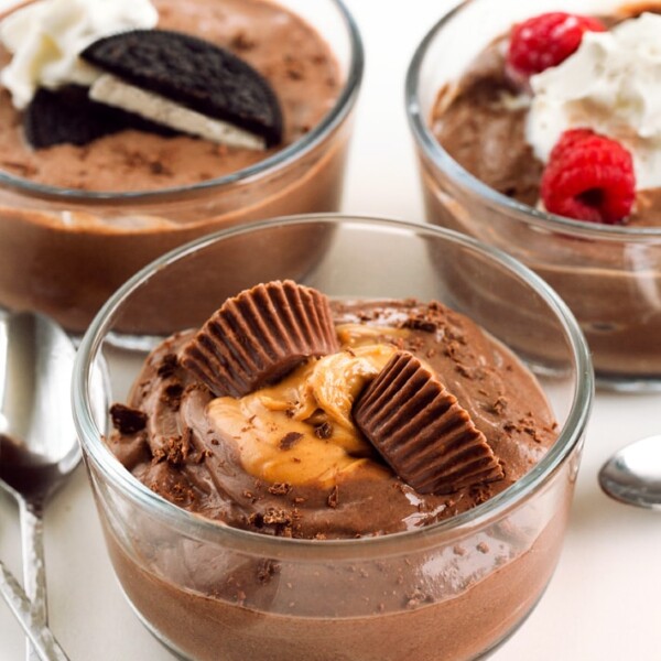
For example, the new recipe page is incredible!
A picture of every recipe! Plus there’s a fancy slideshow on the homepage, and the sidebars are much less jumbled now. If you think I managed these feats by myself… you are giving me way too much credit. Allow me to introduce…

Julie Farber from Deluxe Designs.
Julie is amazing; I wish I knew half of what she knows about web design. Julie can design your entire site for you if you don’t want to worry about a thing. In my case, however, I preferred to be very involved, and she was ok with that, too! I drew up elaborate screen shots in Photoshop of exactly what I wanted—right down to the color scheme and layout—and Julie took it all from screen shot to real-time website without crashing anything, which I would certainly have done if I’d attempted it without help. She was patient and non-judgmental, while still offering sage web designer advice. (You can thank her for the fact that there are no giant polka dots on the top of the page: one of my not-so-bright ideas she talked me out of!)
And those beautifully-organized new photo pages I mentioned earlier? All Julie’s work. I can’t tell you how many things I asked for, while being almost positive she’d come back and tell me such things weren’t possible. Yet every time, she instead responded—quite quickly—she’d made the changes. In short, if you need design work for your food blog (or photography blog, company website, etc.), Julie is your girl! EDIT: Julie will give a 15%-off discount to anyone who mentions CCK in his/her inquiry.
Still to come:
1. The heart logo: The header that you see now is an interim thing, so don’t worry if you’re not big on the heart; it’s not staying! I am not big on it either. I’m a perfectionist and haven’t been able to come up with the perfect logo yet, so I quickly designed this shutterstock-esque heart logo to stand in. The rest of the new design was ready, and I just didn’t want to wait any longer!
2. We’ll probably be making more minor adjustments in the next few days, so give the site a little time to adjust. And Julie is working on perfecting the mobile version of the website as well.


I really like it! So fresh! But I would really like it more if you were holding a mug that says “cocoa” or “hot chocolate” in your welcome photo. More applicable to the overall theme. Yes?
I love it! It looks so much better! Much more professional.
One comment. I wanted to comment and tell you and I had to hunt quite a bit, and then go into the individual post, and even then had to scroll to the bottom to figure out how to post a comment. Maybe a link on the home page with each post?
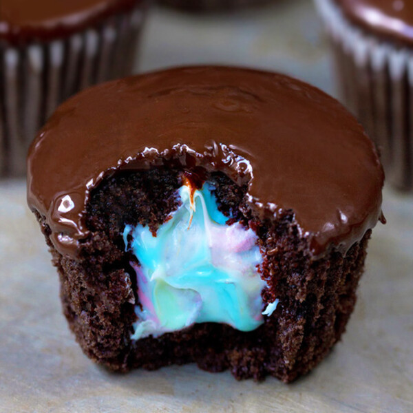
Same here…I thought at first that I wouldn’t be able to comment, but then realized that I had to click on the post itself, then scroll down to comment. But other than that, I love the new design! And the melted, dripping chocolate look on “Katie” in the header? Makes me want to get something really chocolate-y…and fast.
You should not be able to comment from the homepage. Katie’s requested we have a link at the bottom of the post, but you should not have to click on the individual post in order to comment anymore. Thanks for your feedback!
Oops! I mean you *should* be able to now!
Sorry but I still don’t see it. Like others even I had a bit of trouble figuring out how to comment so being able to comment from the home page would be nice. I don’t see a “comment” option from the home page, maybe I am missing something obvious.
I had the same problem when I came to comment that the header has disappeared. Also, the header has disappeared, it’s just a blank grey space up there, but the header link to the homepage still works. FYI. (Chrome on Ubuntu)
I had the same exact problem yesterday! Glad to know it wasn’t just me 🙂
LOVE IT — great job, Katie and Julie!
adorable!
the site looks great! I think set up a smart phone friendly site for your blog would also be a good idea, I love to read your post on my phone, but the new site is a little harder to read on it. Love your blog and can’t wait to see what other changes will be coming!
Fresh, supertight (englishdutch), love it!
New site looks FABULOUS, just like you! <3
It’s lovely, and it’s making me even hungrier than your old site design! So that’s success for a food blogger, right? 🙂
Looks great! I love the bright and clean color scheme and your new photo is cute!
I like it a lot. The recipe organization is great (though I think some pictures may not be matching their posted title).
It is loading kinda slow for me though. Slower than it used to. Maybe it’s the amount of pictures when clicking on the different categories.
Great new look! I LOVE YOUR SITE! Its become my dessert Bible over the last year 🙂 thank you!
I love the new design! I tried to stop by this weekend and the site was down, so I was excited to see the changes you were making! It looks just like you described, grown-up and youthful, whimsical and modern, and super cute! 🙂
I like the new look! it is always fun to freshen things up. I like how it is a clean, uncluttered design.
I view your site through my Android tablet, and I usually use the desktop view rather than the mobile view on websites. For some reason, the sidebar on the right is really wide… about 50% of the width of the whole page. In your snapshot, the sidebar looks nice, narrow, and tidy. I am sure your designer can solve the problem easily.
Hi Deanna!
I am working on getting the site to be more mobile responsive. This site is highly customized and as such, as you can imagine, with several different types of devices using different browsers, all with different sized screens it takes quite a bit of work. But I appreciate your comment and will certainly work on addressing it! Thanks.
I totally understand, I do a little website design on the side myself. The thing that made me let you know was that in the regular desktop view it still wasn’t correct. Not criticizing at all! And I am totally patient about these things. You have done a great job! It really is a challenge to meet the needs of so many browsers/devices these days.
FYI… just checked, Chrome, newest version – on my laptop… same issue.
Honestly, I truly love this new design… and yet… no matter what it looked like, I would still come to read because I love Katie’s personality and recipes. 🙂 And the photographs… make me hungry. I tried taking some photos the last few days just for my personal cookbook I keep in the kitchen, and discovered that photographing food in an appealing way really isn’t very easy! This new design really compliments everything I love here.
I love it!! So fresh and fun!!
Katie the new site is amazing! Very modern and fresh. The pop of colors at the top against the white are really fun and display the energy you give us everyday! Julie did a fantastic job!
I love it! All the white makes it so clean and uncluttered, and I love the recipe section!
Two things I wanted to mention:
Some people already brought this up – it wasn’t easy to find the comments for the post.
Also, I’m not a fan of the slideshow at the top of the homepage. It’s a bit big, and when I get to the site, I have to scroll down before I can start reading.
Just my two-cents! Great job!