
What do you think of the new website?
(If you’re reading this post through email, click here to see the new site.)
Going into the process, I knew I wanted something bright and cheery – but also whimsical yet modern, and youthful yet grown-up. (Contradictions galore.) It’s taken many months of hard work to get here, and I am so excited with how the design finally turned out! Perhaps one of my favorite parts of the new design is how organized it is:

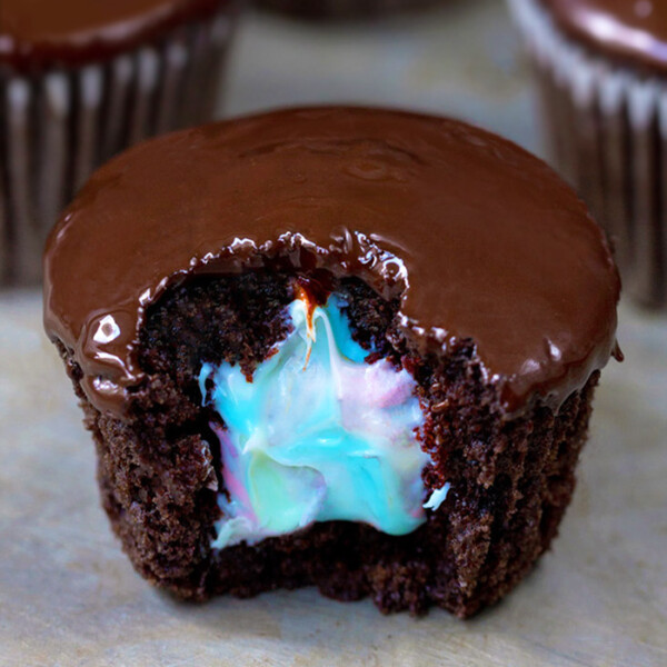
For example, the new recipe page is incredible!
A picture of every recipe! Plus there’s a fancy slideshow on the homepage, and the sidebars are much less jumbled now. If you think I managed these feats by myself… you are giving me way too much credit. Allow me to introduce…

Julie Farber from Deluxe Designs.
Julie is amazing; I wish I knew half of what she knows about web design. Julie can design your entire site for you if you don’t want to worry about a thing. In my case, however, I preferred to be very involved, and she was ok with that, too! I drew up elaborate screen shots in Photoshop of exactly what I wanted—right down to the color scheme and layout—and Julie took it all from screen shot to real-time website without crashing anything, which I would certainly have done if I’d attempted it without help. She was patient and non-judgmental, while still offering sage web designer advice. (You can thank her for the fact that there are no giant polka dots on the top of the page: one of my not-so-bright ideas she talked me out of!)
And those beautifully-organized new photo pages I mentioned earlier? All Julie’s work. I can’t tell you how many things I asked for, while being almost positive she’d come back and tell me such things weren’t possible. Yet every time, she instead responded—quite quickly—she’d made the changes. In short, if you need design work for your food blog (or photography blog, company website, etc.), Julie is your girl! EDIT: Julie will give a 15%-off discount to anyone who mentions CCK in his/her inquiry.
Still to come:
1. The heart logo: The header that you see now is an interim thing, so don’t worry if you’re not big on the heart; it’s not staying! I am not big on it either. I’m a perfectionist and haven’t been able to come up with the perfect logo yet, so I quickly designed this shutterstock-esque heart logo to stand in. The rest of the new design was ready, and I just didn’t want to wait any longer!
2. We’ll probably be making more minor adjustments in the next few days, so give the site a little time to adjust. And Julie is working on perfecting the mobile version of the website as well.


I love the new look, it looks amazing. Clean and organized!
Adorable, unique, clean, simple, sophisticated…so basically perfect. I love it!
(Then again I don’t think I’d be turned away from your site no matter HOW you designed it so long as you kept pumping out the same amazing recipes and Katie-ness that you always do. But still. This new look is great!)
Congratulations – I love it!! 😀
It all looks great Katie! I know you’ve been wanting this for a long time, congratulations!
(I’m looking forward to the print option on all your recipes too!)
I love the new layout! It’s so pretty and colorful. =) The picture recipe section is the best and easy to use.
I like it a lot! Great work! 🙂
I love it! I need to get a serious overhaul of my blog but am in the middle of planning my wedding. After that – I hope to have something even 1/2 as awesome as yours. Congrats!
Love, LOVE, *LOVE* IT!!!! Weird thing was, I noticed all those elements you mentioned (youthful, grown-up, whimsical, sophisticated, etc.) and thought how well it all went together and how much I loved the fact that you could incorperate so many seemingly paradoxical design components into one cohesive, beautiful blog! My sisters and I are just thrilled with the happy new design…it makes us smile! The recipe pages are amazing (one of my favorite parts as well), but I must say, I love the heart logo…it’s so cute and fun! 🙂
Great look! Love the clean, simple yet bright and cheery look of it! The header is definitely a big improvement. I LOVE how you get a little pic of each recipe in the recipe index!
I love the white. So much brighter and cleaner. Makes me want to stay on your blog EVEN longer… hmm, that could be dangerous!
LOVE it!!!
LOVE LOVE LOVE LOVE LOVE LOVE
P.S. I even like the heart in the header! 🙂
Looks great! The organization will really come in handy!
But, ask Julie about a plugin for “print friendly” or have her make the site print with a little extra CSS. You shouldn’t have to redo all the recipes. (:
So long as the content doesn’t change, I will still be on board the CCK blog boat
Bravo to you! I am overhauling the look of my site and it’ll launch on it’s 5th birthday on Feb 22 – I am totally excited and anxious, as I am sure you were. Beautiful job – I do like it more and feel more dessert-y now!
I hate you and your new site.
I love the new site! Its much more organized now! I think a good change to add would be adding step by step photos to each post.